The power spectrum
The spectrum of a signal represents its frequency components. It shows how the signal's energy is distributed over different frequencies. A spectrum plot is a graphical representation of the signal's spectral content.
The power spectrum (or magnitude spectrum) represents the strength of different frequency components in a signal. It is usually obtained by taking the Fourier Transform of the signal and computing its magnitude. As we’ve seen in Appendix D, the power of the sinusoid is given by:
\[ P(f) = \frac{|X(f)|^2}{2} \]
The power spectrum in the discrete case is:
\[ P(k) = \frac{|X(k)|^2}{2} \]
For a DC signal (\( k=0 \)):
\[ P(0) = |X(0)|^2 \]
See Appendix D for details.
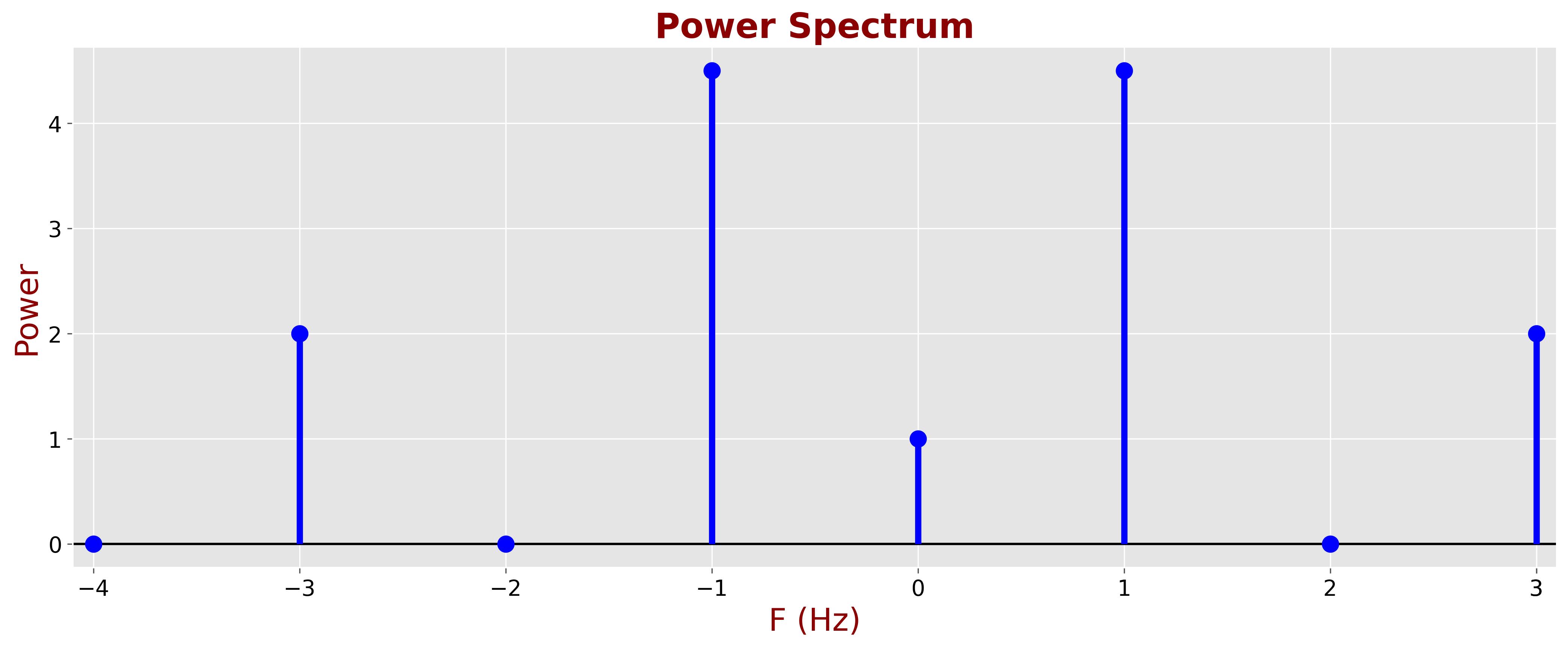
The following plot represents the power spectrum for our example.

Plot Interpretation:
- The x-axis represents frequency.
- The y-axis represents power (magnitude squared).
- Peaks in the power spectrum indicate dominant frequency components.
Note that in many applications we are less concerned with absolute power values and more with power ratios, such as the absolute power values. Consequently, DFT normalization is often unnecessary, and we compute the power spectrum as:
\[ P(k) = |X(k)|^2 \]